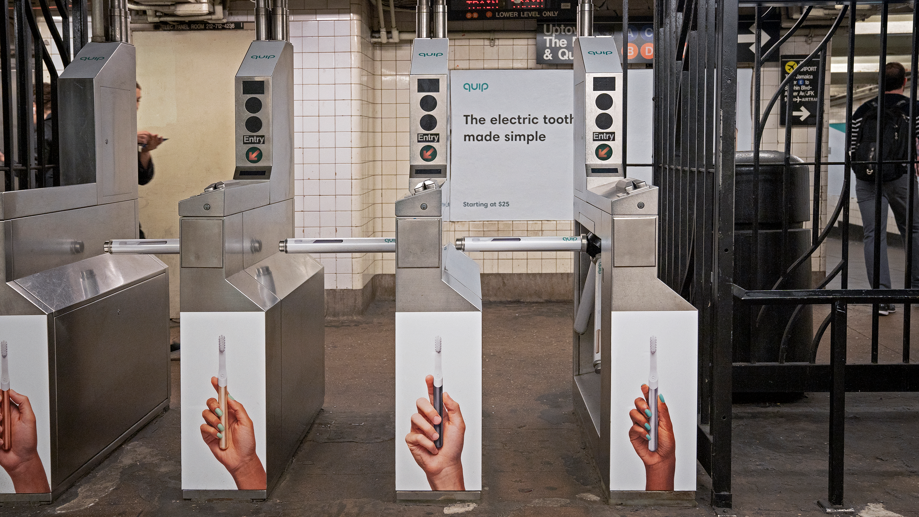
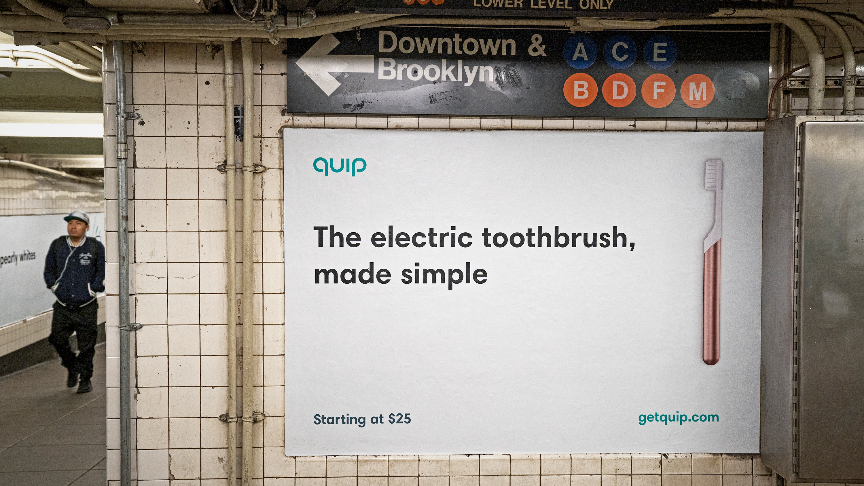
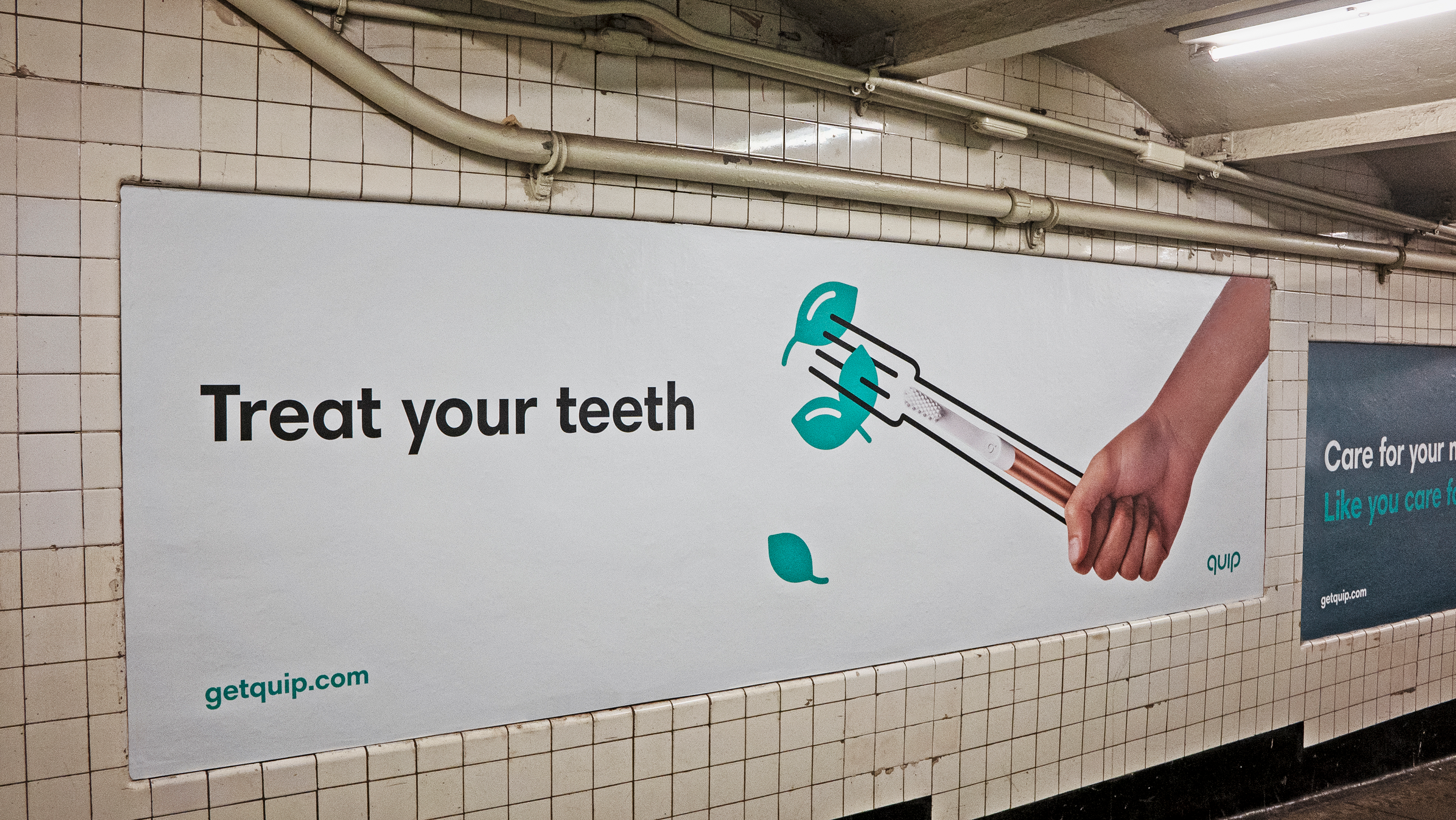
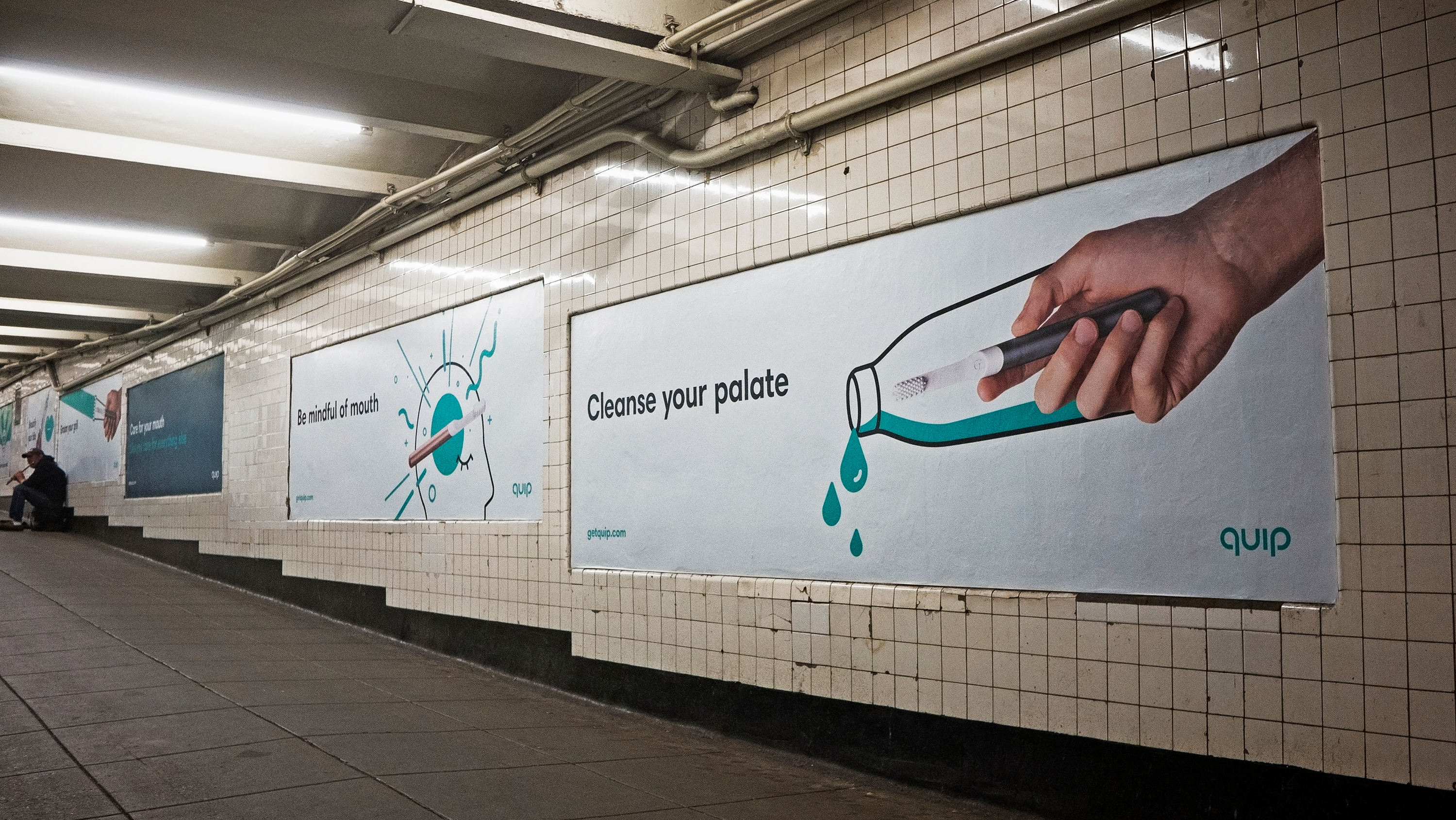
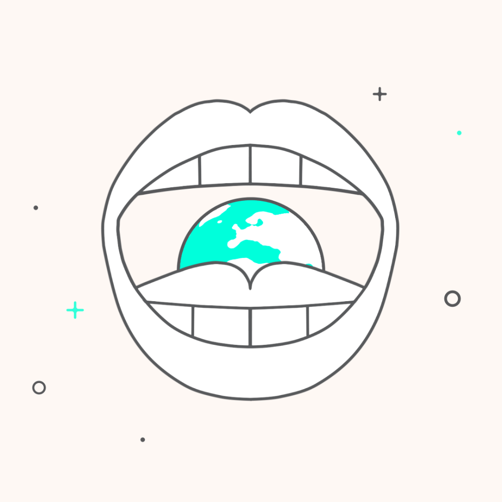
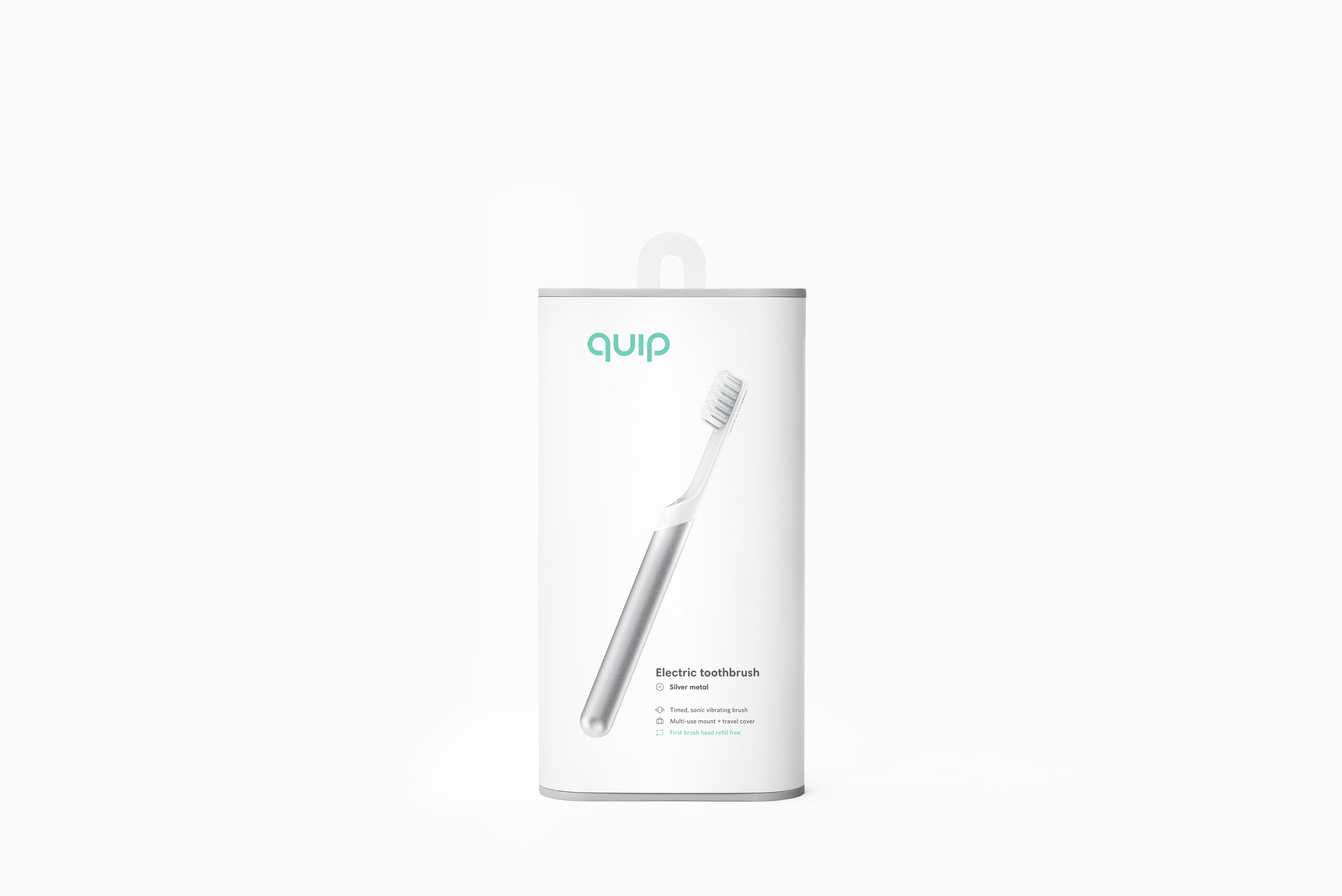
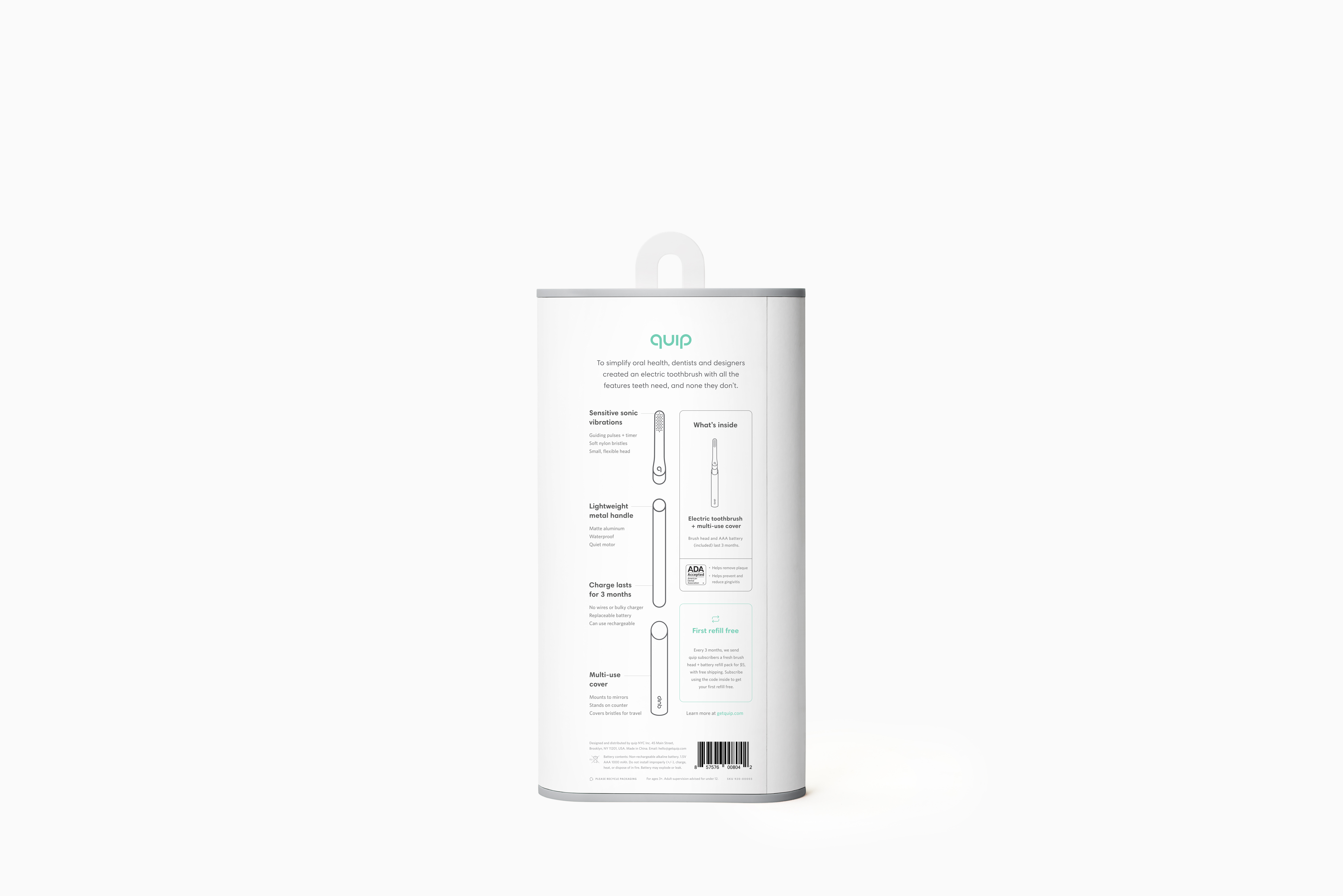
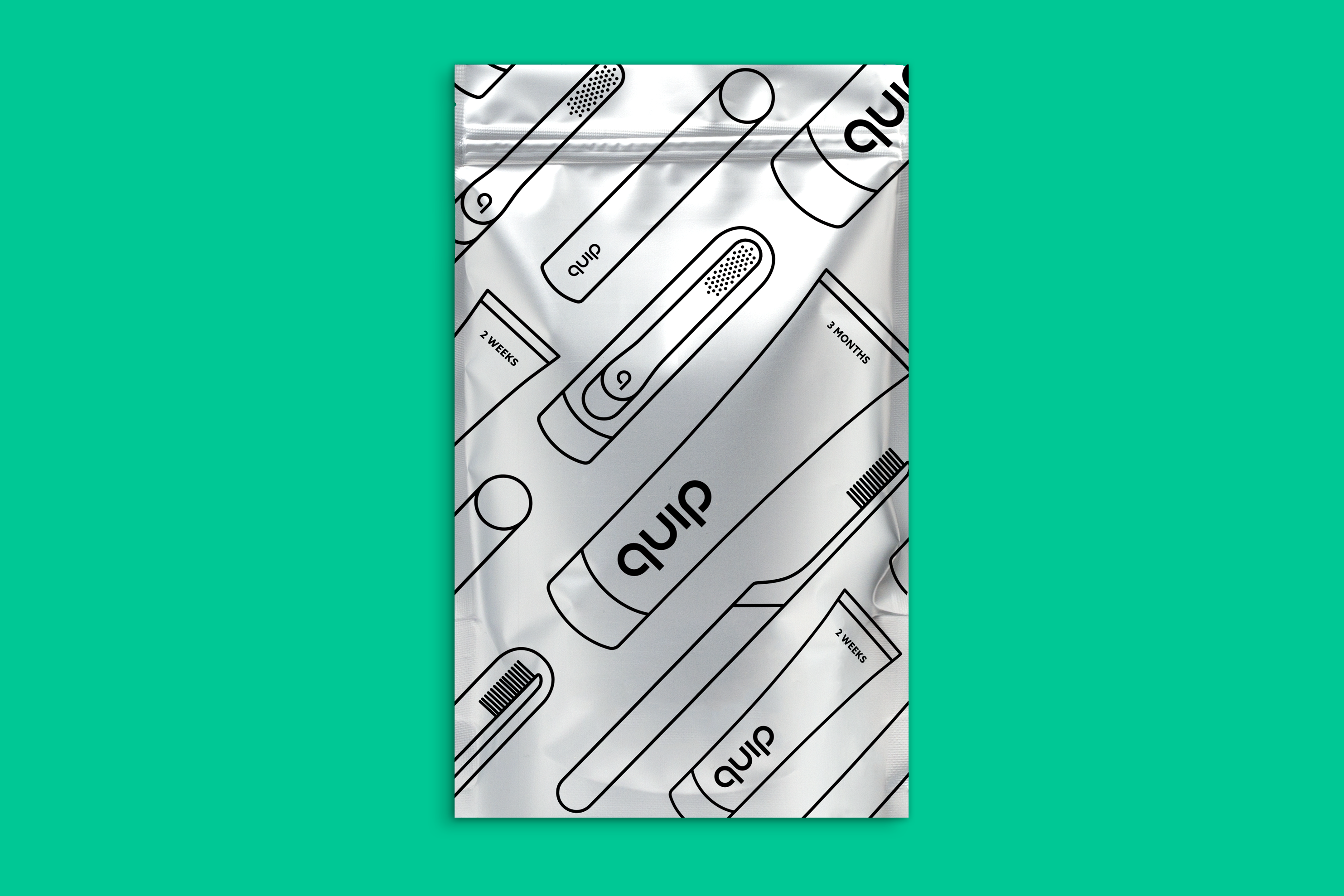
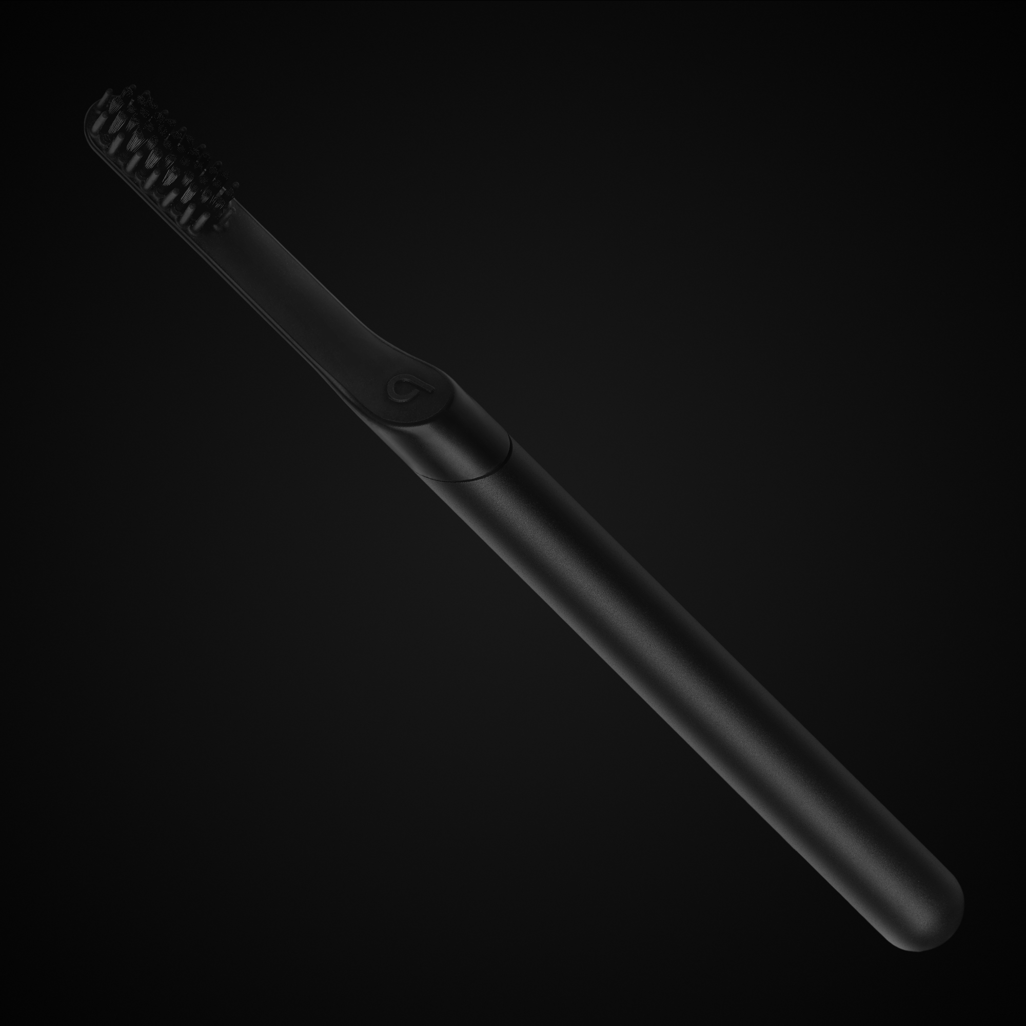
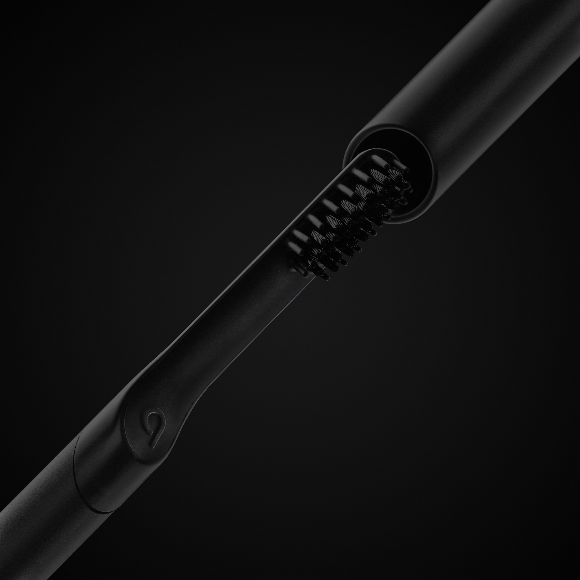
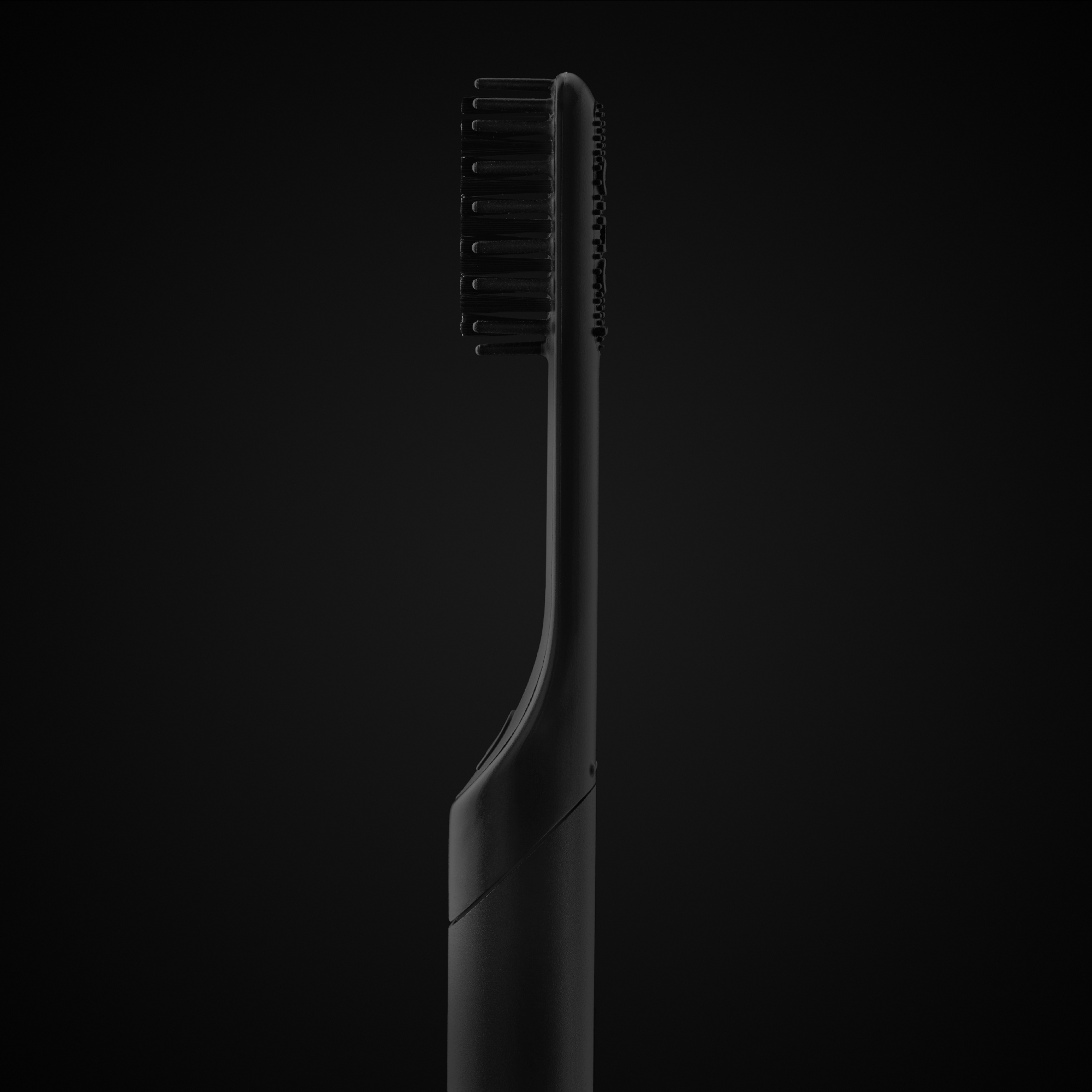
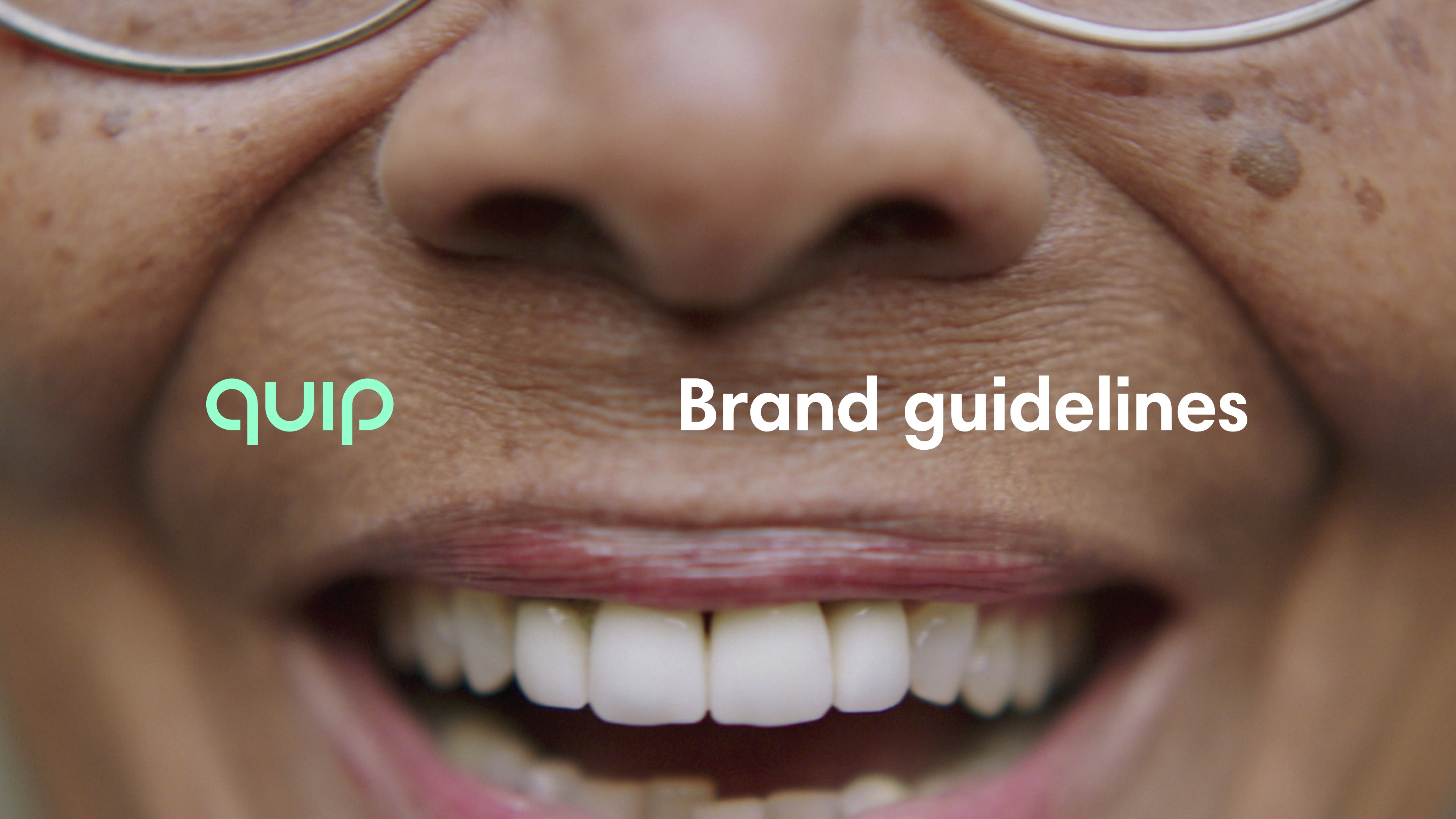
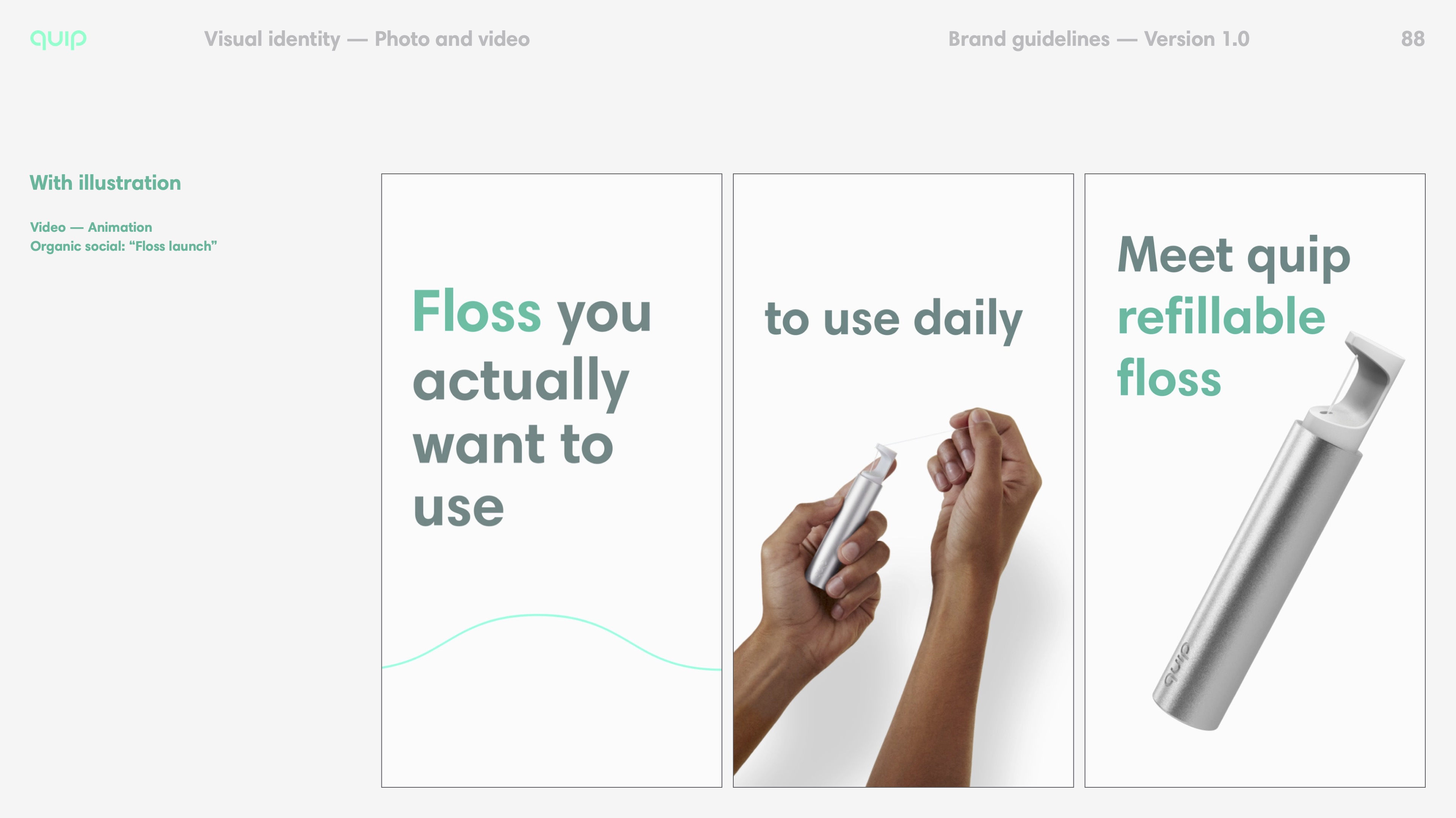
quip

Care for your mouth


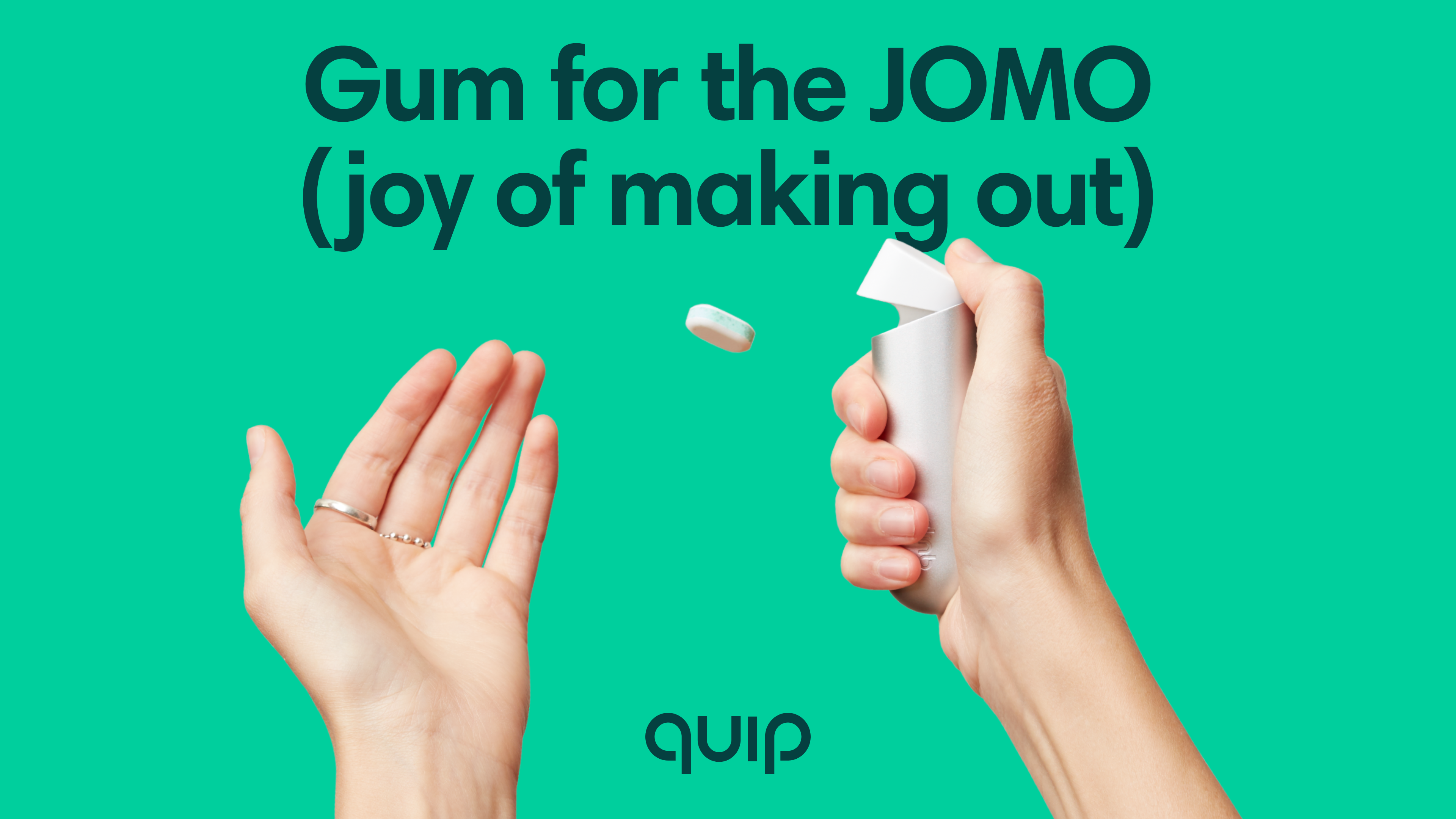
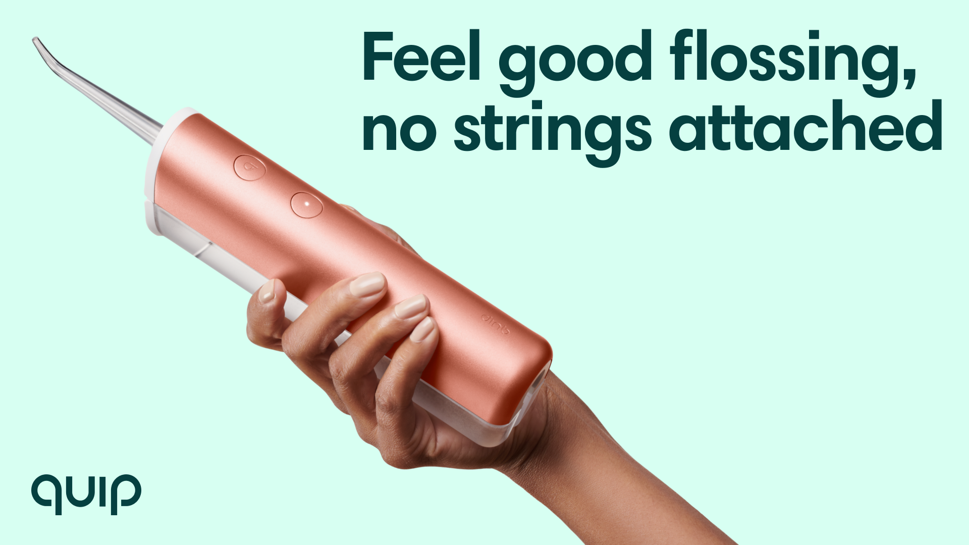
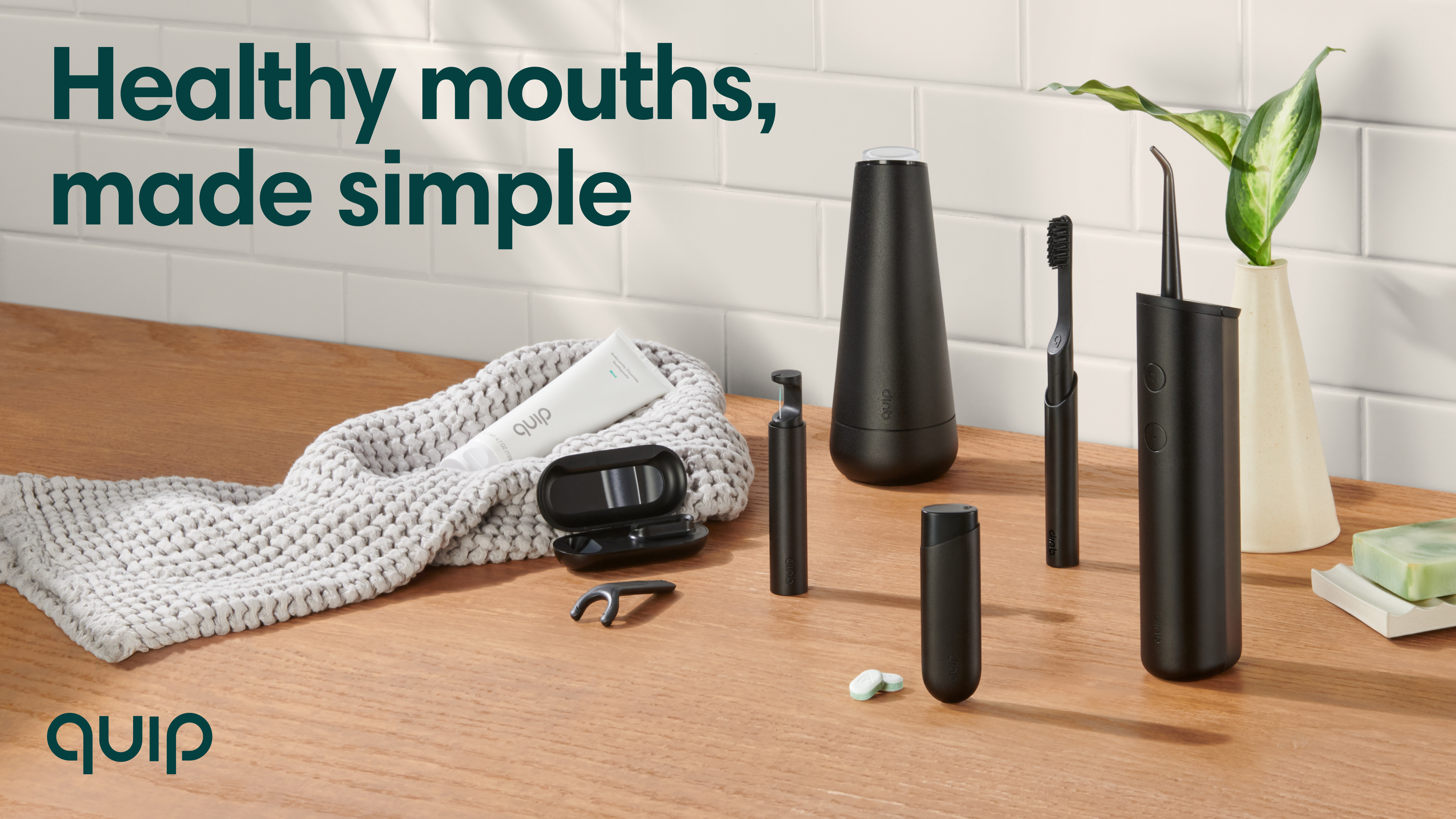
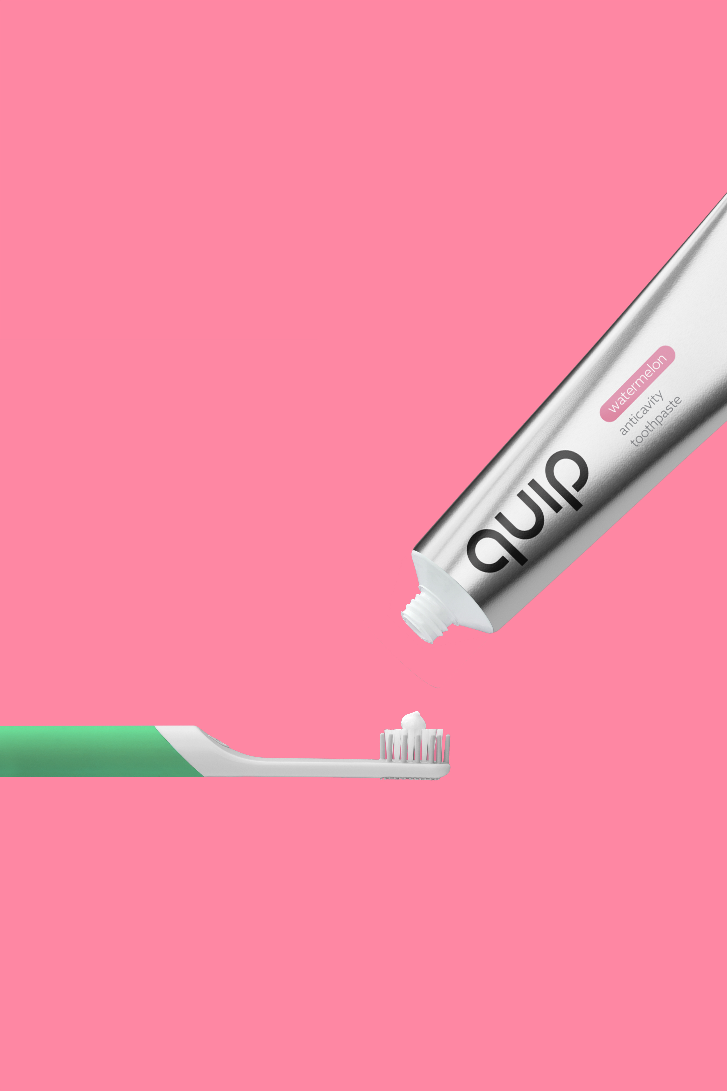
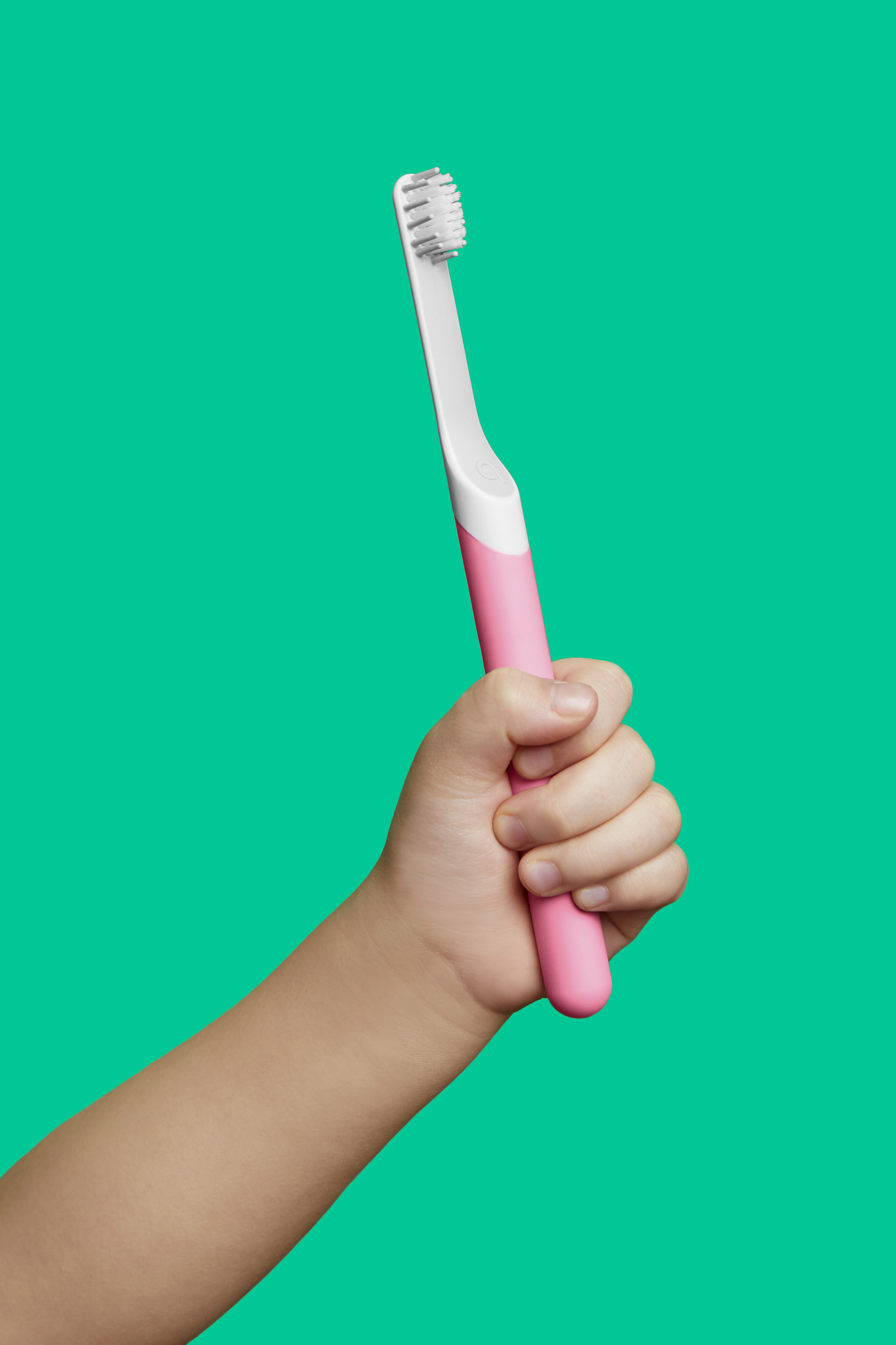
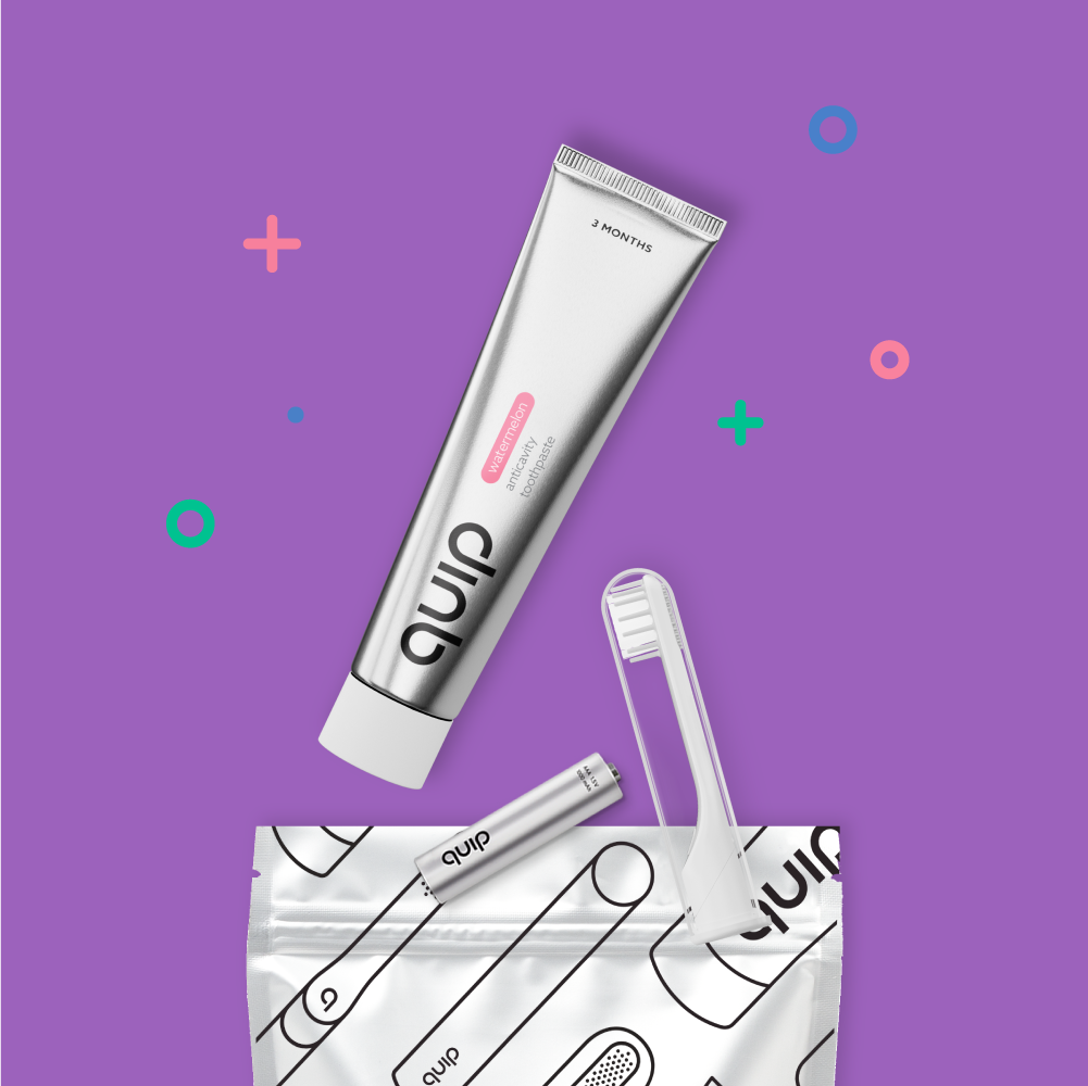
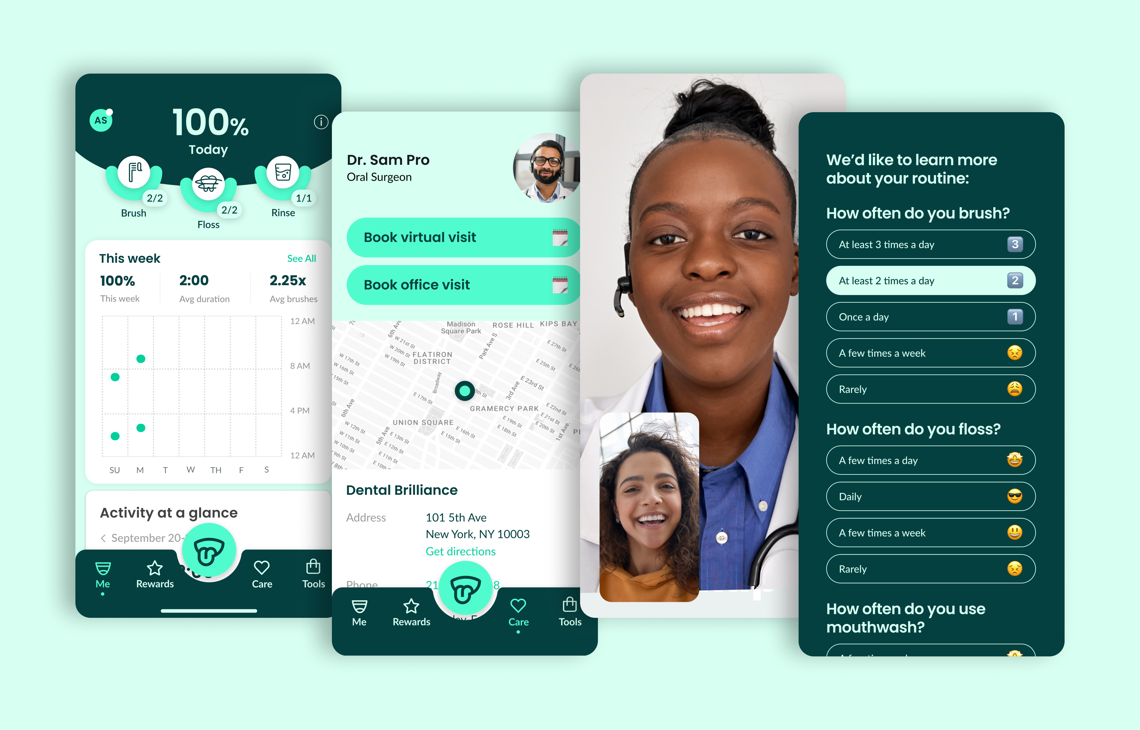
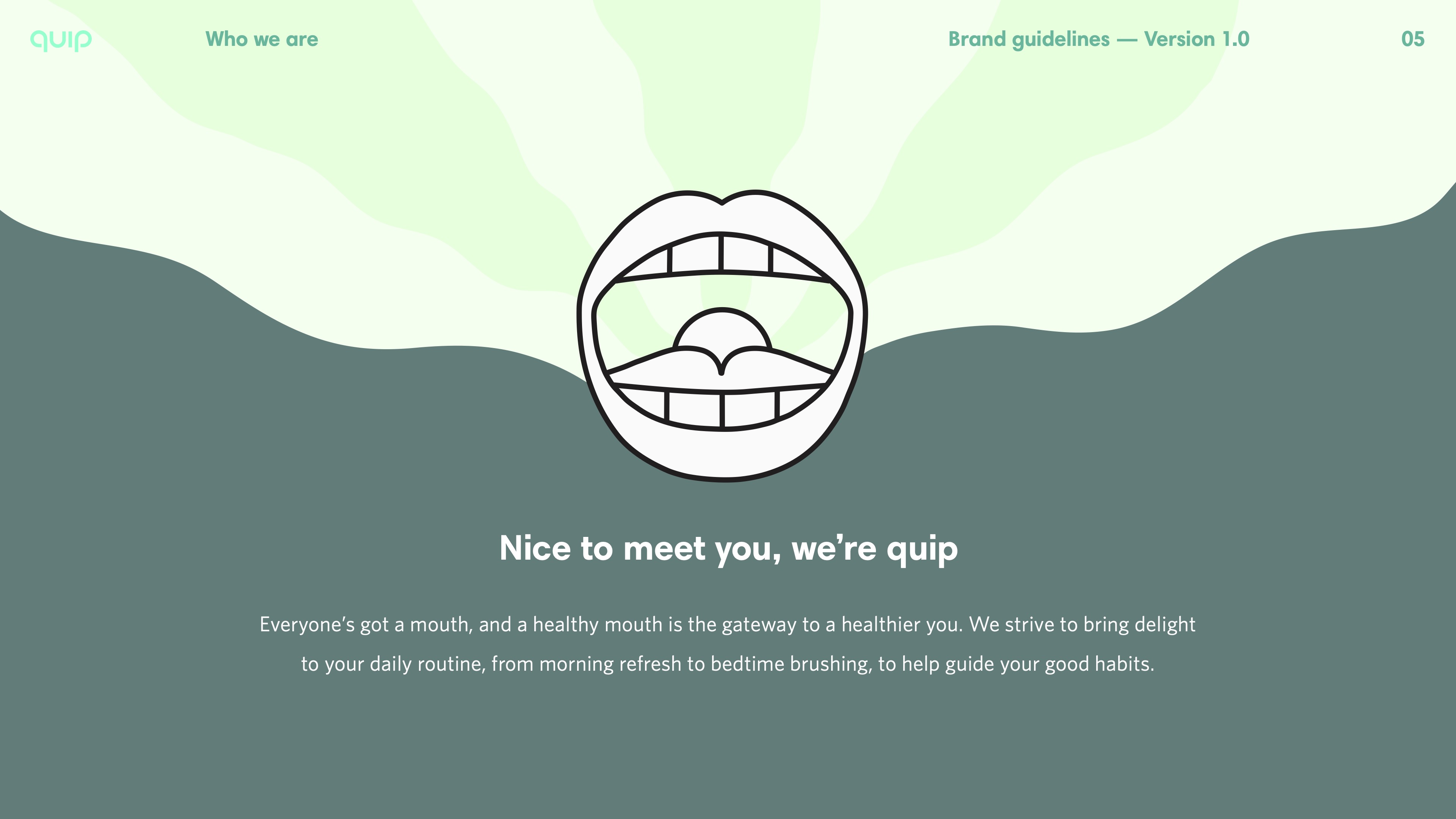
Mouth care made simple, friendly, and a more-beautiful experience. Quip’s brand identity is sleek yet friendly, with a bit of a bite.


A better brush

Partnering with creative studio Sandwich, we parodied other gimmicky oral care versus quip’s approach.


Illustration for the monthly newsletter, Mouthoff.


From store to your mailbox

In-store and quip’s subscription service packaging followed the style of the products. 


Mouth care made simple

Simple and straight-forward illustration and product renderings helped to to explain how to better care for your mouth, and pointed you to subscribe to supplies delivered automatically.


Color played an important role in all photography and product releases—shifting depending on the context of the products and their materials. 


The quip app

As connected products launched, quip made it easy to keep track of oral care habits. The quip app rewarded consist habits, even making finding a dentist remotely and nearby possible.